How I built my dynamic portfolio website
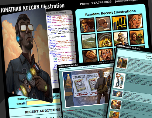
For an illustrator or designer, redesinging one’s web portfolio can be one of the most gut-wrenching projects to work on, as you are often your own worst client to work for. I have probably dozens of photoshop files of various versions of ‘new’ designs for my website that never got built. Meanwhile, my site was growing some cobwebs, and my long-overdue overhaul was dead in the water.
So last fall, I made a deal with myself: You can keep the general design of the site in tact for the time being, but for god’s sake, make the site dynamic — SOMEHOW…and do it fast!
sketchbook 35
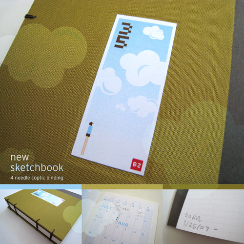
i was long overdue for a new sketchbook, so last night i made this. ive been noticing and obsessing over clouds lately… my dad was a huge fan of them. he used to take rolls of film of them… so i guess this is a recent self-portrait in a way…
the bookcloth is from papersource. i really wish there were one of these in philly. the binding is a “4 needle coptic”. I’ve only done that once before, but i think the result is pretty nice and simple. the inside paper juts out from underneath the covers. i’m not sure if i like it, but i wanted to try it. (i usually like it on other books.)
the other bottom 2 photos show the rest of my sketchbook making “ritual.” i always create a notes/calendar section in the back and i always write the “d.o.b.” in the front. bookmaking is so rewarding.
ps stay tuned for > new studio < information. here's a peak at the new space that my friend brian and i will be sharing. it’s in this philadelphia landmark building. fun fun!!!
Siren Music Festival 2007

Whoa. This was the first year I had the pleasure of attending the Village Voice Siren Music Festival. Yeah, that was my big bald held up there hob-nobbing with the rest of the VIP’s…Invisibleman Paul Antonson of course was responsible for getting us on the guest list as he has created the amazing poster art for the show for the past seven years, though I’d say this year’s was a standout.
This shot above is The Noisettes‘ amazing Shingai Shoniwa who electrified the crowd early on with a fun and rockin’ set. MIA who I have been waiting a long time to check out in person was also a treat, and The Black Lips put on a cool performance, though they shoudn’t have blown up Popcorn the chicken. I didn’t get over to the other stage, and I missed the New York Dolls, but still a pretty incredible fun day. Thanks for the access PA!
My Siren pictures on flickr
Paul’s Siren pictures on flickr
Harry Potter interactive for WSJ.com
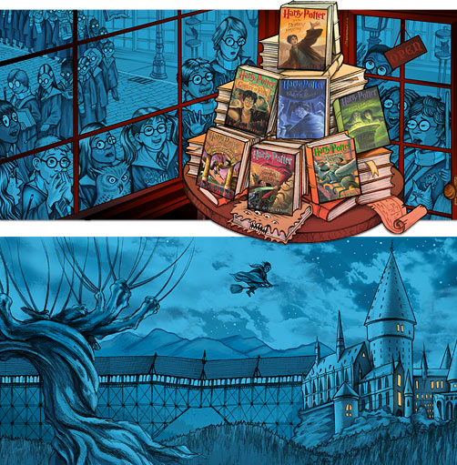
I had a really fun time working up these Harry Potter illustrations for a The Wall Street Journal Online interactive. Click here to see the infographic, complete with floating scrolls (ala the Marauder Map) and animated owls. I haven’t read the books but I really dig the films and was very enthused to illustrate within that universe. The entire time I worked on these the Harry Potter theme music was swirling through my head.
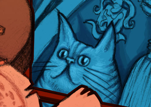
And really, I’d be remiss if I didn’t address the best feline actor we have today and the true star of the entire Harry Potter series: Crookshanks the Cat. (As you can see from the illustration he is first in line to get his paws on ‘The Deathly Hallows’). When I saw the new film ‘Order of the Phoenix’ and saw the work that Crookshanks had done, the type of cat actor he’s become… well, I wept openly.
Holographic Self-Portrait
This is a video of a hologram, which admittedly, is a little convoluted. The hologram and camera are still and the only thing moving is actually the light source. Yeah, I made it and I still have trouble wrapping my mind around it.
I had the chance to make only one image, so, I thought something as ephemeral as bubbles might be perfect. Now, I’ll always have a three dimensional image of myself from this time in my life.
I made it at the Center for the Holographic Arts in Long Island City, Queens, through a continuing education course at The School of Visual Arts. The Holocenter is a non-profit arts center that has an amazing artist in residency program. It is one of only a few places in the world equipped with a pulse laser camera, which is a holographic laser fast enough and large enough to capture an image of a person. So, I consider myself very privileged.
The course seems to have been discontinued. Luckily, the Holocenter facilities are available for artists to create their own work and their equipment can be rented for a reasonable fee. Just email them for more information. Pictures (or videos) do not really do the images justice, you just have to see them in person to get the full effect.
You can go to the Holocenter to see some or Holographic Studios, which seems to be another place in NYC to check out and possibly make holograms. Although, I honestly don’t know much about them.
Upper Gosling, Casco Bay, Maine
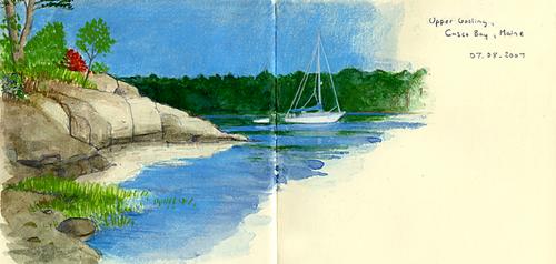
Just after July 4th, Corrie and I spent three days kayaking and camping in Casco Bay, Maine. The trip was truly amazing. Organized through L. L. Bean, our small group of ten was led by two enthusiastic and experienced guides to the Goslings, two small islands, where we created a base camp. From there we explored the surrounding area, practiced our kayaking skills and got very, very wet while waiting out a storm. All our meals were prepared by our guides and all of it was top notch. We even had lobster! In fact I had two!!
A Flickr set our trip can be found here. Most of the images have captions and all have been placed on a map.
The sketchbook image above was begun on the trip but completed at home thanks to some gorgeous photographs taken by one our guides, Gregg Bolton.
Set by Step Slideshow
Last year, I worked on this illustration for a regional magazine which I was really happy with. Unfortunately, as often happens in the magazine world, the story got held and the art never ran.
I recently got the OK to use the art for my promo purposes since it was languishing in editorial limbo for so long, so I though I’d pub this step-by-step slideshow that I put together while working on the piece, but never posted.
My process has changed a bit since I did this piece (I now use a lightbox to transfer the sketch to real paper rather than vellum), but I still think it’s a good peek into my process. I’ll try to document some more of these in the future, as I loved reading Step-by-Step Graphics magazine, and I think the simple tutorial can by one of the great ways to learn.
You can see the full pictures here and see a nice large version of the art on my site here.

