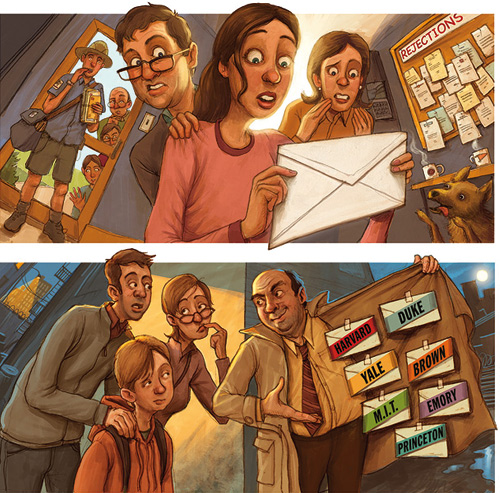
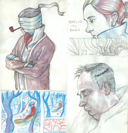
These are my first illustrations for The Hartford Courant. They ran a series of stories this week covering the college application process. The drawing on the top ran with a pair of stories that dealt with how both the students and the parents deal with the anxious waiting period in different ways.
The story that the bottom drawing ran with was about a new breed of private consultants who promise to help get your kid into the best school, starting very early on.
You can see larger versions here and here.
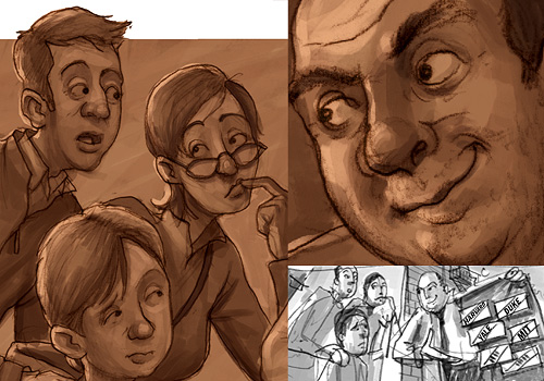
I’m working on the second drawing of a two-part newspaper illustration series tonight (due tomorrow morning!)…Just wanted to share how much I enjoy the underpainting part of my process…Working out the values alone can be very satisfying. Then, you must wade into the unknown currents of the color. Exciting, but can be scary. At this stage, I try to stick to the burnt sienna hues, just liked I used to in ‘traditional’ paintings. Texture is key at this point…Gonna be a long night!
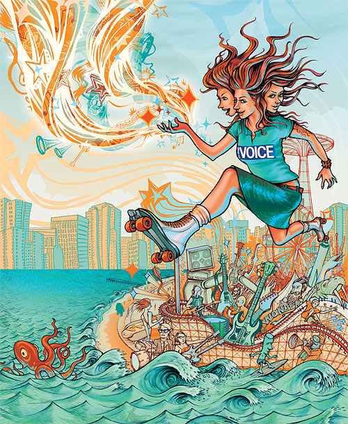
Here’s the poster/ad art I’ve come with for this year’s Siren Festival in Coney Island. Click here or on the image to see a larger version. I’d initially come up with a blue/red/purple color scheme but after I began the color temperature felt too cool for this setting, so I added lots of yellow. Because Dave Bias designs a variety of ads and posters for the Voice at different sizes I gave him the final art with the Siren and her magic swirl on separate layers. The big open space to the left of the Siren will facilitate the names of the bands playing the fest. And yes, that is John “Stumpy” Pepys (Ed Begley Jr.) from Spinal Tap playing the drums by the big wave.
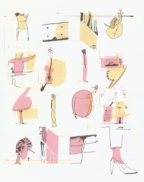
Some recent bits from the sketchbook; subway riders, post-snowboarding doodling and a rendering of InvisibleMan’s founding father.

it’s been too long since a post. i’ve gotten into my acrylics this week. (thanks again “drawing methods” class.) it was somewhat liberating, though the other side of me wants to keep learning actionscript… there’s never enough time to do it all. anyway, thought i’d share this lovely pollockyesque image.
enjoy!

Last week I created this illo for The Wall Street Journal Online of the new Fed chairman Ben Bernanke trying to impress upon reporters and economist’s what kind of tough chairman he’ll be.
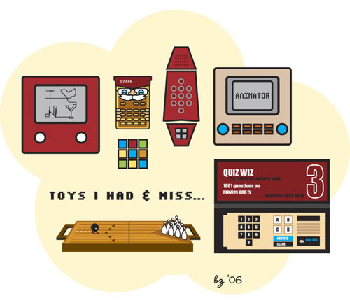
as i sit here thinking about my thesis show and the ideas of games and play… i decided to draw the long lost toys of my youth.
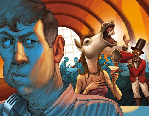
I have an illustration in Tuesday’s Science section of The New York Times (2/13/06). The story was written by a Parkinson’s patient, who suffers from “audio illusions” as a side effect of his medication (or perhaps just because of the Parkinson’s). A woman laughing too loud in a restaurant is transformed into a neighing horse, and a man with a booming voice becomes a circus ringleader with a megaphone.
This was strange, fascinating story to draw. I chose not to feature the primary ‘illusion’ of the story, Marilyn Monroe singing “Happy Birthday Mr. President”, though it probably would have gone with the headline more. The author experiences illusions that his brain creates after hearing real sounds, which I felt was best represented by the more surreal laughing horse-lady and ringleader in the restaurant. I’m most satisfied with the composition, as I really wanted the shape of the room to appear as ‘sound waves’ focusing in on his ear…
Also, my palette for this was fully inspired by the electric gouache paintings of the master Lou Romano.
I’ve just finished up a pair of sketchbooks, and I’ve posted them on my sketchbooks gallery on my website. These books are roughly from 2005 to present, and I felt very good wrapping them up. I am now moved into my new handmade book, and the paper is so much better than these Moleskines. I love the form of the Moleskines, but the paper is just crap. Watercolor fights to be absorbed, and ultimately fails. That is why there is such a lack of color in these books.
LINK: Jon Keegan’s Sketchbook Gallery
i am taking a class called drawing methods. the assignment was to “have an idea. start the idea. forget the idea. change the idea. alter the idea.” um. ok.
this started out as pencil drawing, then i scanned it and vectored it in illustrator, then printed it out and used pencil on the printout – responding to and drawing on the shapes… it was fun. i am thinking of silkscreening the first guy in on the second line. i like him. he is little billy and the giraffe…
ps i tried the custom photoshop brush thing with little billy and yes i agree – its pretty cool.