Queensboro Bridge
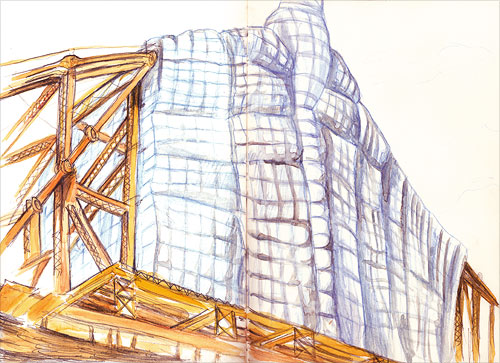
The Queensboro Bridge is undergoing some rehabilitation lately and is partially wearing a Christo-like shroud. The sketch above I drew from York ave and the photo below nearby.


The Queensboro Bridge is undergoing some rehabilitation lately and is partially wearing a Christo-like shroud. The sketch above I drew from York ave and the photo below nearby.

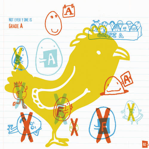
is there a difference between failure and rejection? i was thinking of that… and willy wonka. (good eggs and bad eggs) “rejection” was created for illustration friday. go & participate!
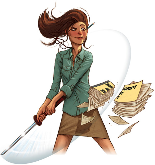
This is an illo I just did for Publisher’s Weekly. This installment of the Soapbox column was penned by author Harriet Rubin who sums her rallying cry for more old-fashioned editing as follows:
“Builders of ancient temples in Asia typically carved two huge statues at the temple gate. One holds a book, the other a sword. The book symbolizes knowledge. The sword is there to remind people to cut things off: to edit. Knowledge is not wisdom until you slice through the words you hear, judge them and are moved to silence.”
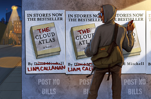
This is an illustration I did a few months ago for Publisher’s Weekly “Soapbox” column. This is a regular feature where authors, editors and other publishing figures get a chance to rant, rave or tell a personal anecdote about the industry.
This installment of the column was a particularly painful (yet funny) account by the author Liam Callanan who had just published his book “The Cloud Atlas”. Thinking he had coined a clever and unique title, he was more than disappointed when he found that his own publisher had just released David Mitchell’s “Cloud Atlas” (one of my favorite books in the past few years by the way). Worse yet, Mitchell’s “Atlas” went on to receive heaps of praise and critical acclaim (even a breathless mention on a soap opera). This all lead to confusion at the book store, and misguided letters to the author. He took it all in good spirits though, and had a good sense of humor about the whole affair, noting how this has happened to many authors in the past.
So for the illustration, I imagined Callanan engaging on a guerrilla street campaign to alter the promotional campaign for Mitchell’s book, and co-opting it for his own title.
See more of my work for Publisher’s Weekly here
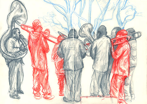
I came across these eight guys playing some incredibly tight New Olreans jazz in Washington Sq park a few hours ago. The tuba especially was blowing out.
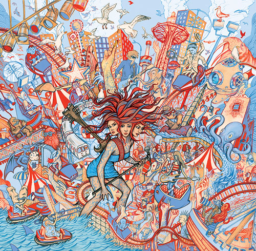
The artwork for this summer’s Siren Music Festival put on by the Voice. I tried to capture the insanity and culturally brackish waters that is Coney Island while keeping the color palette limited to the reds and blues I’ve liked working with lately. Last summer I took a photo on the boardwalk of a man feeding seagulls frenchfries. He’d just hold them up in the air and the seagull would float down and gulp ’em right out of his fingers. That was partial inspiration for this illo and the moment is recreated right above the siren. Click here or on the image to see a larger version. The date is Sat. July 21st.