Poster illustration I’ve created for cool upcoming collaboration between a great restaurant and wine group in Burlington Vermont. I need to keep mum on the details for now but I will post additional information when I can!

I recently participated in a benefit for “Powered by a Girl” a campaign designed to educate teen girls about the impact of media on their lives and empower them use their creativity, wit, and individuality to make a difference. Tilbury House Publishers invited illustrators to submit a 6″ by 4″ drawing which would be sold to benefit the campaign.
The idea was to submit an image which best represented who we are, so naturally I worked up the pencil and watercolor drawing on the left. Before mailing off the furry fellow I scanned it and colored a version in photoshop. I was happy to hear the event was a success and the yeti is enjoying his book in a nice new home.

I’ve just finished this illustration for the 2010 Siren Music Festival held by the Village Voice in Coney Island each July. This actually marks the 10th year in a row that I’ve created the art for Siren and its somewhat interesting to look back at the previous years work to see how I’ve evolved as an illustrator. In terms of the assignment we decided on the Siren having three heads because it sort of jived with the greek mythology of Siren’s hanging out in groups of three, but we never expected that there would be a second Siren Fest let alone ten. In some ways I think I’ve done the same drawing each time, just with a different interpretation.
It’s been an honor to be able to work on something which has soaked in the amazing, culturally-brackish waters that is Coney Island. It has such a important and bizarre place in history (well chronicled in Rem Koolhaas’s Delirious New York) and its been a real treat to be able to give it my own strange take. Why is there always a Yeti, Creature from the Black Lagoon, Black Manta, Easter Island guys and an Octopus hanging out? I don’t know but if that every manages to occur in the real world it will happen there. Coney Island is going through its latest round of upheaval and strife (well documented in this project) which is sad on many levels and yet oddly organic as well.
Huge thanks to Diane Perini who has chosen the lineups and been the driving force for all of Sirens 10 years and has given me tons of support. Mike Gibson has been doing the logos and design of the ads, posters and t-shirts in recent years and has just made the whole thing sing.

I recently completed this batch of fun illustrations for Orange Coast Magazine out in Orange County, California. These were for the magazine’s summer beach guide, and the series of articles offered lots of tips for how to achieve “Beach Bliss”, such as:
- proper surfing etiquette
- how to score a fire pit
- how to ensure parking karma
- how to change at your car
- how to deal with dirty beach bathrooms
The lifeguard drawing ran with an open letter from a lifeguard to parents about some of the things to keep in mind when bringing your kids to the beach. Art direction by Mindy Benham.

This is a painting I just finished of Mc Sorley’s Ale House in New York. It’s one of my favorite places. I spent quite a bit of time there, when I went to school in Rochester at RIT. I know, it was a long commute, and as John Belushi said in animal house, “7 years of college, down the drain.”

This illustration ran in The New York Times on Sunday, February 21, 2010. The article (written by Steven McElroy ) describes various strategies that theater directors are employing to try and curb the persistent problem of audience members’ cellphones ringing during performances.

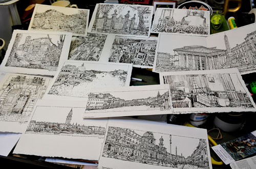
Here are a few inked sketches I did on my trip to Italy. Most are from reference photos that I shot, although a couple are from life. I shot 7800 composite photos in 2 weeks just in case. I save time by shooting from the hip and it doesn’t disturb the locals. I’m trying to do a new blurb sketch book of images from Italy. It’s a challenge to do a 100 paintings for a book. Stay tuned.

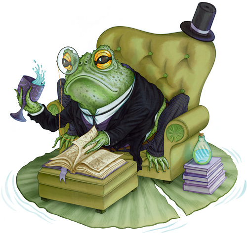
For one thing, this dapper gent is a toad and not a frog. I know this because he has fingernails which are something frogs do not possess (at least that’s what a guide at the The Frog Pond of Monteverde told me).
I’ve set out to make my portfolio more cohesive and geared towards kids books and I thought a character study or two would be in order. Next up: maybe an octopus.


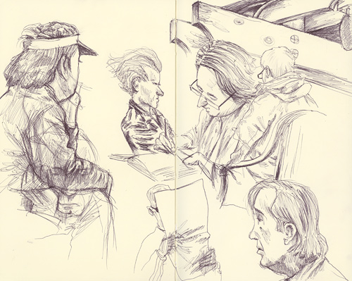
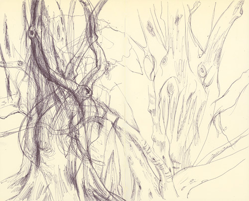
I’ve done some sketching around town during this break in the storms that have been pummeling California these past couple weeks (El Niño I salute you). The top sketch was done on the patio of Old Soul here in Midtown Sac and the second sketch was drawn in the Leland Stanford Park which surrounds the Capitol building and has a wide array of cool trees.

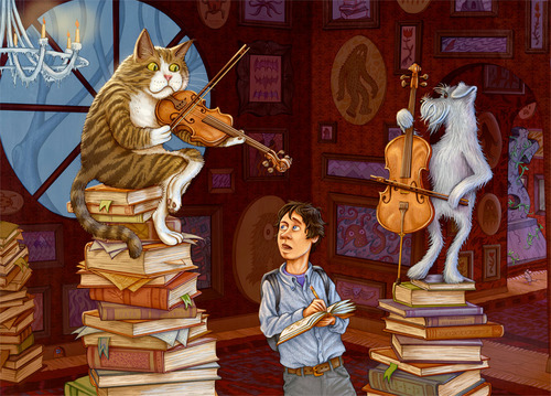
Just sent this image off to Modern Postcard to have a batch of 5×7’s printed up. Been toiling away on this illo the last few weeks and I’m pretty happy with the final result. Lately I’ve made an efffort at getting my portfolio more geared towards the children’s illustration market and I wanted to push this one further than I usually go. Thanks to InvisibleMan Keegan for some great suggestions and prodding.
And while the resemblance is not striking I did base the cat off of Maru. Click on the image to view larger.


