Poster illustration I’ve created for cool upcoming collaboration between a great restaurant and wine group in Burlington Vermont. I need to keep mum on the details for now but I will post additional information when I can!

I recently participated in a benefit for “Powered by a Girl” a campaign designed to educate teen girls about the impact of media on their lives and empower them use their creativity, wit, and individuality to make a difference. Tilbury House Publishers invited illustrators to submit a 6″ by 4″ drawing which would be sold to benefit the campaign.
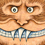
The idea was to submit an image which best represented who we are, so naturally I worked up the pencil and watercolor drawing on the left. Before mailing off the furry fellow I scanned it and colored a version in photoshop. I was happy to hear the event was a success and the yeti is enjoying his book in a nice new home.

I’ve just finished this illustration for the 2010 Siren Music Festival held by the Village Voice in Coney Island each July. This actually marks the 10th year in a row that I’ve created the art for Siren and its somewhat interesting to look back at the previous years work to see how I’ve evolved as an illustrator. In terms of the assignment we decided on the Siren having three heads because it sort of jived with the greek mythology of Siren’s hanging out in groups of three, but we never expected that there would be a second Siren Fest let alone ten. In some ways I think I’ve done the same drawing each time, just with a different interpretation.
It’s been an honor to be able to work on something which has soaked in the amazing, culturally-brackish waters that is Coney Island. It has such a important and bizarre place in history (well chronicled in Rem Koolhaas’s Delirious New York) and its been a real treat to be able to give it my own strange take. Why is there always a Yeti, Creature from the Black Lagoon, Black Manta, Easter Island guys and an Octopus hanging out? I don’t know but if that every manages to occur in the real world it will happen there. Coney Island is going through its latest round of upheaval and strife (well documented in this project) which is sad on many levels and yet oddly organic as well.
Huge thanks to Diane Perini who has chosen the lineups and been the driving force for all of Sirens 10 years and has given me tons of support. Mike Gibson has been doing the logos and design of the ads, posters and t-shirts in recent years and has just made the whole thing sing.

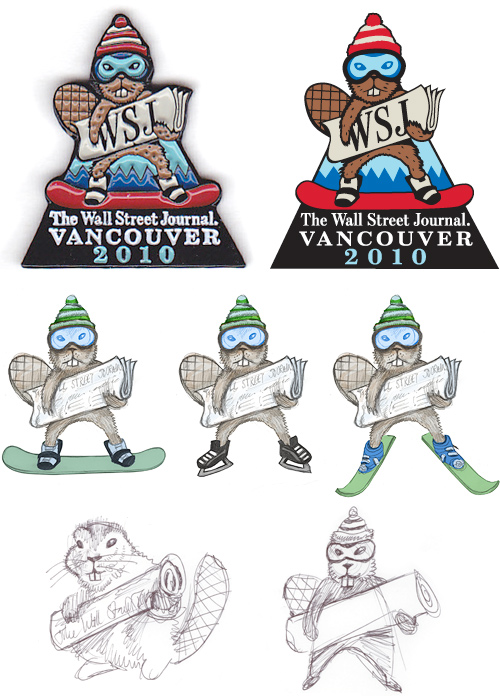
In the course of my employ in the wsj.com art department I recently had the opportunity to design their Olympic pin. Pin trading is a long tradition at the Olympics so it was an honor to do it. Editor Adam Thompson had requested I do something fun that perhaps included a beaver or perhaps a mountie. So I came up with these designs and naturally the beaver-on-snowboard look won out. I delivered the vector version (top right) and it was cool to see how the final product came out (top left). One of these just sold on ebay for $52.75!

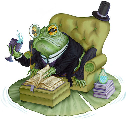
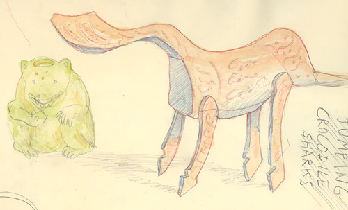
For one thing, this dapper gent is a toad and not a frog. I know this because he has fingernails which are something frogs do not possess (at least that’s what a guide at the The Frog Pond of Monteverde told me).
I’ve set out to make my portfolio more cohesive and geared towards kids books and I thought a character study or two would be in order. Next up: maybe an octopus.


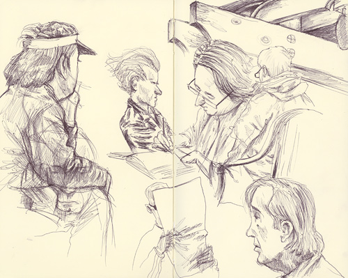
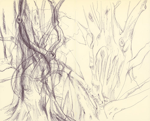
I’ve done some sketching around town during this break in the storms that have been pummeling California these past couple weeks (El Niño I salute you). The top sketch was done on the patio of Old Soul here in Midtown Sac and the second sketch was drawn in the Leland Stanford Park which surrounds the Capitol building and has a wide array of cool trees.

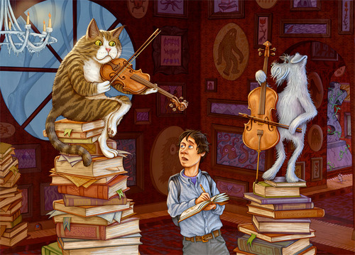
Just sent this image off to Modern Postcard to have a batch of 5×7’s printed up. Been toiling away on this illo the last few weeks and I’m pretty happy with the final result. Lately I’ve made an efffort at getting my portfolio more geared towards the children’s illustration market and I wanted to push this one further than I usually go. Thanks to InvisibleMan Keegan for some great suggestions and prodding.
And while the resemblance is not striking I did base the cat off of Maru. Click on the image to view larger.

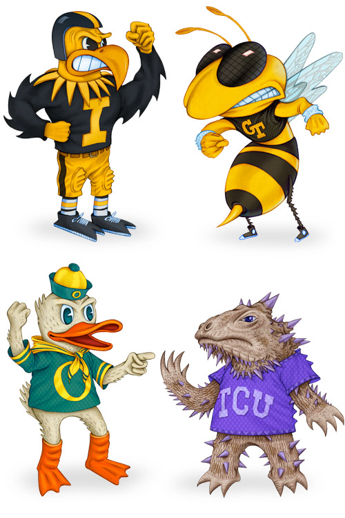
Some new characters for this year’s Wall Street Journal college bowl game rundown. We went the throwback theme of electronic football for the animation this year which was a fun way to go. And you can’t go wrong illustrating a horned-toad either.

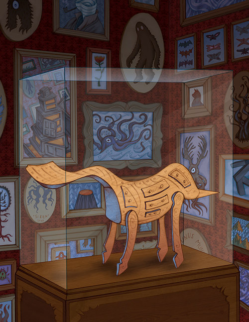
A few months ago I’d had started this drawing for my ‘Cabinet of Curiosity’ project and had completed about 75% of it. I was working on it right up until my wedding/honeymoon/move-to-California and had pretty much forgotten about it by the time we got set up and running out here. I had also given it a bland filename which wasn’t helping jog the memory. But I stumbled across it the other day and put a polish on it.
I’d initially had a different object atop the pedestal (a wooly mammoth with a castle-saddle) but it wasn’t really working for me. So instead I worked up this horse sculpture which I had sketched while viewing a show of ancient Chinese art within the Metropolitan Museum of Art in 2005:


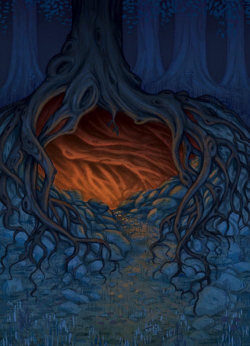
We’re deep into autumn now so naturally my mind starts to linger on the ideas of Joseph Campbell, Hobbits, strong ales, falling leaves and the forest lairs of folkloric creatures. This drawing came out of the sketchbook and was finished off in photoshop and sorta captures my mood as of late.

