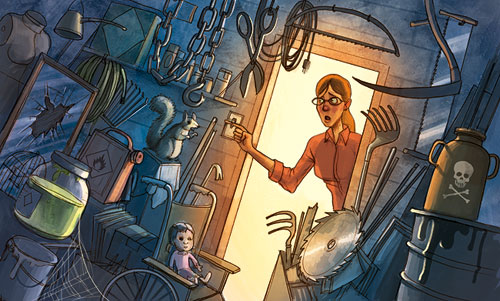
This illo will be in this Sunday’s New York Times on September 24th, 2006. The story is about how most people’s garages are dark, scary places full of the tools of yard work and labor, rarely resembling the brightly light neat workspaces shown in catalogs.
See more of my work for the Times here.

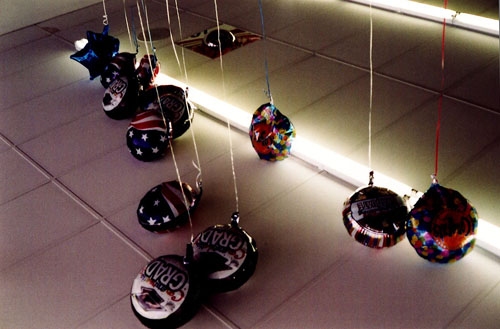
a photo from a $.99 store. I’ve always thought that these places were worth something pictorially.

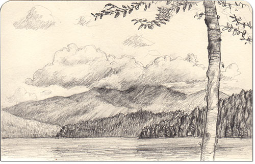
Congratulations to our good friends Susannah and Mike Italiano who got married up Lake Placid, NY this weekend. My wife and I spent an amazing weekend with them up at the fabulous Lake Placid Lodge with the above jaw-dropping view out of our lakeside cabin window. The weather was perfect and the leaves were just starting to change, and it reminded me of how much I love this part of the Adirondacks. Click below for another sketch of a cool birch tree on the lake.
Click here to read more »

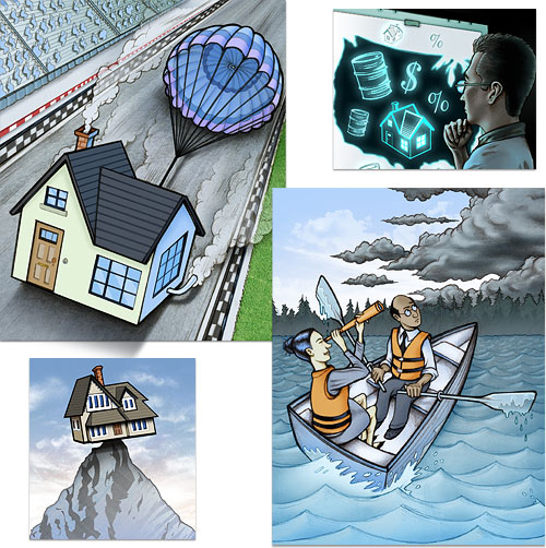
A collection of some of the recent economic forecast illustrations I’ve done for wsj.com – note the recurring housing theme.

This is a painting from an ongoing suburbia series. This is an earlier one. Lately I’ve been interested in entertainment, like trampolines, playgrounds or swimming pools.
Posted by bz in photos
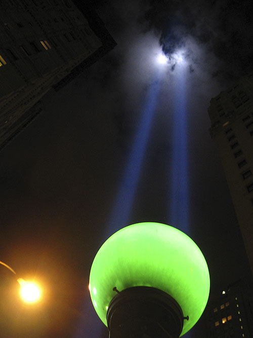
On September 11, 2006||

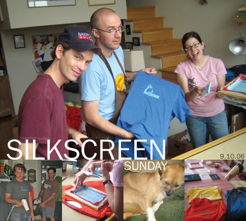
yesterday was fun. it was nice to finally meet everyone. maybe next time maybe more creation/less production… but all in all a fun and productive day! we must plan another one. 🙂

Sights from the #1 and F trains.

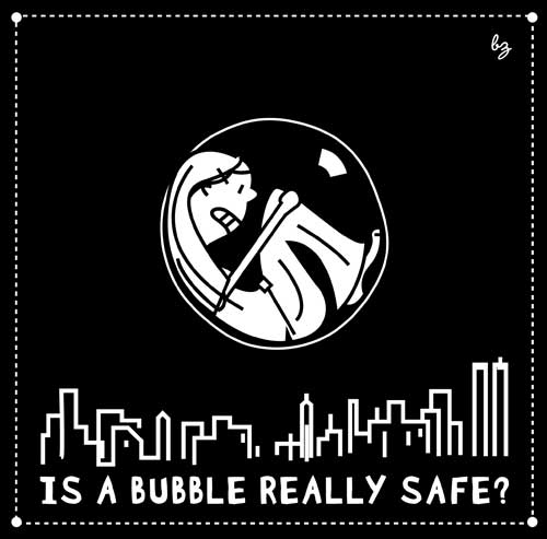
wow – 5 minutes past midnight… that’s cutting it close! here is my illustration for “SAFE” – this (past) weeks illustration friday. i wanted to work in b/w, and for obvious reasons, i have new york on my mind this week. five years went by so quickly… i miss you nyc.

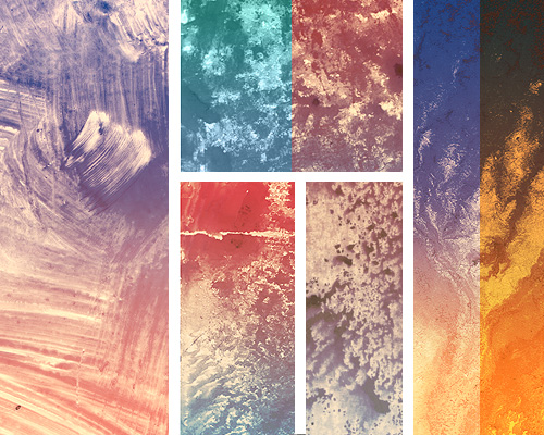
Spent some more time in the Lab this weekend beefing up my texture library. I painted with acrylic and gouache on acetate, gessoed illustration board, butcher paper and cardboard. The coolest results were painting right onto acetate with gouache. Always fun to get messy and experimental. I scanned these in at 600dpi @ 100%. Having a bunch of these files lying around has been invaluable to me as I strive to add more texture to my digitally painted illustrations. Nothing worse than a flat, paint-bucketed expanse.
One illustrator who has really mastered the art of balancing the real paint texture look with crisp digital illustration is Linzie Hunter of the UK. She also started the fabulous On My Desk blog, full of photographs of illustrators and designers’ workspaces. Check it out!
