Bison
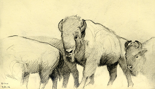 Yesterday I had the opportunity to sketch at the American Museum of Natural History. Here is the result. Click the link and explore the diorama this was sketched from online.
 Yesterday I had the opportunity to sketch at the American Museum of Natural History. Here is the result. Click the link and explore the diorama this was sketched from online.
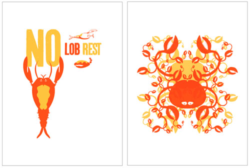
two/2:00 am ideas for a silkscreen… the theme (which i did not choose) is “not lobster.”
also, my MFA thesis show is now up in philly till may 1. i posted a few quick pix from the opening on my flickr site.
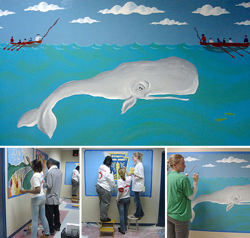
This past Saturday was “Hands on New York Day” with the volunteer organization New York Cares. Along with the Manhattan Young Democrats and my girlfriend Kristina we had fun painting murals at the Bronx Leadership Academy. Someone had lightly sketched out the Moby Dick image and we came along and painted it in. New York Cares provides volunteer support to schools and parks in the five boroughs and is a worthy group to help out with.
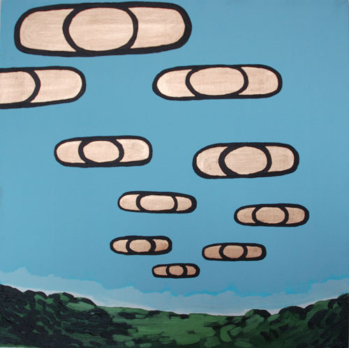
I’ve been looking for abstract images to paint or draw and lately I’ve focused on explosions. As awful as they are, explosions are as common as haircuts. I’ve been trying to capture the physiology of an explosion and embrace it as a fact of this living.
I just completed this illustration for The New York Times (Thurs. April 20th, Style section), dealing with women and A.C.L. (anterior cruciate ligament) knee injuries.
The reference came from Eadweard Muybridge’s classic “The Human Figure in Motion”, which is an invaluable resource for how the body moves.
I couldn’t resist whipping up a quick animation of these nine frames from the illo.
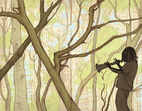
Yet more for the Flavorpill folks. The woods were drawn in Prospect Park and the horn player in Washington Sq. Park.
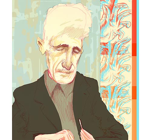
This is a portrait of George Orwell – and an example of taking a previous sketch and doing more with color.
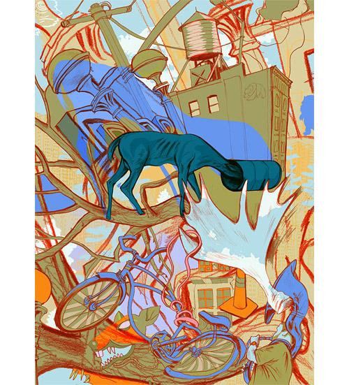
I’ve recently created some graphic works for Flavorpill. I took it as an opportunity to play around with different stlyes and take older projects and sketches and breathe new life into them. The city vs nature theme has crept in there as the image above can attest.
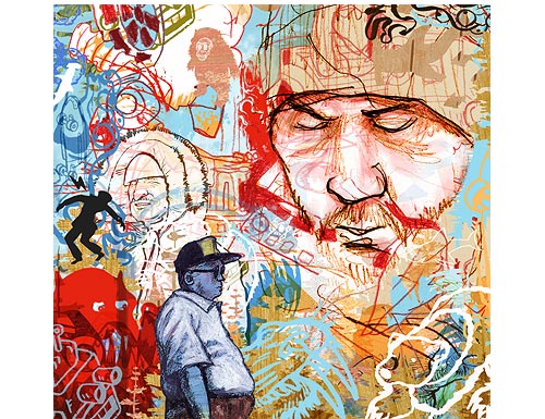
For this illo I wanted to give the feel of a graffiti wall of the sort you might find in Soho, with layers of paint, paste-ups and stickers. Also wanted to make it very cropable.