Shrek Blows

I have gone on many a long-winded rant as to why I think the Shrek films blow. This is my opportunity to put it all down in one place, succinctly, with visual aides.
Assumptions
The following are immutable facts, that I will not address in this entry:
– Pixar is one of the most creative entities working today, and they will continue to produce the gold standard for all forms of animation for the foreseeable future. Pixar’s movies are all better than Shrek.
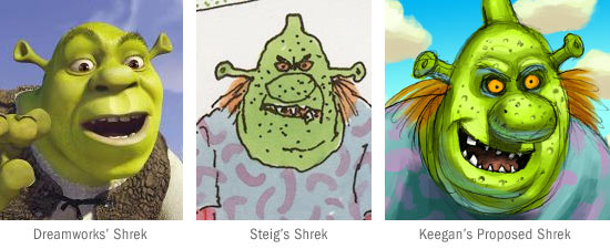
– William Steig’s original Shrek children’s book is off the hook. I don’t consider myself a huge fan of it, but it’s a very original piece of work. The movie would have been a hell of a lot more interesting to look at had Shrek looked just like Steig’s character.
– I have no problem with a charming original children’s book being made into a slick commercial film. It can be done, and with some integrity too. Of course, not much needs to be said about the exceptions to this, like Polar Express. That would require another enormous post to address…
Why Shrek Blows
Bad Character Design
This is really the crux of my argument. Shrek just looks BAD. That character they ended up with does not look like it was spawned in an artist’s imagination. Shrek’s overall shape looks like something a creative artist may have come up with. It’s the FACE that is the trouble. I had heard about how the Dreamworks people were eager to use Shrek as a vehicle to showcase how they have tackled and solved some of the most difficult technical challenges in representing a realistic world in CGI. The examples listed were something along the lines of hair, clothing, emotive human expressions, etc. They took an interesting silhouette, and slapped on realistic eyes, finely rendered eyebrows, sharply defined lips, and neat even teeth. Totally the opposite of Steig’s scrawled, scraggly character. Out of my concern for this travesty, I humbly offer a quick sketch of what I imagine a more “honest” interpretation of what Shrek ought to look like in the films. See above image…
Bad Comedy
It has long been established that for a successful piece of chidren’s entertainment to truly make it’s mark in the mainstream, it has to satisfy both children and adults. Sesame Street gave children enough credit not to dumb their humor down, and offered a fresh universal humor that left parents satisfied, even if kids didn’t get the full weight of a joke. I think the Shrek films have misappropriated this concept and overdone it, splintering the film into two discreet levels. Yes, both adults and children will laugh at a farting donkey. But do kids get the joke when you reference O.J. Simpson’s white bronco, the chest-bursting scene from “Alien” or a potion labeled “Toadstool Softener”? The film is trying so hard to please adults, that I feel the kids get lost in the day-glo eye candy of it all and don’t really care. One needs only look at Finding Nemo to see a film that finds the truly broad themes of what is funny in the world in which the story is being told (And yes, to be fair there is a pelican fart joke in Nemo, though I think is much better comedy.) A child does not need to be familiar with Alcoholics Anonymous to see why a group of smartly crafted sharks are holding a meeting together, to pledge to not eat fish. The scene is funny to anyone, and this is something that does not happen often in Shrek.
I may add to this as I continue to stew about the commercial success of such a rotten, corrupt piece of work. Thank god for the existence of Pixar. Our world would be filled with dreck like Shrek otherwise.

WILL RAP FOR BLING!
Seriously, very informative blog entry on the shrek … i did not know any of the background behind the green giant. And we both know that pixar, led by Jobs (who turns 50 tomorrow!) would win a dual vs katzenberg seven days a week and twice on sunday!
You forgot to mention that Shrek has a Scottish accent solely because Mike Meyers always does Scottish accents and people need to be reminded that the famous Mike Meyers does the voice otherwise they wouldn’t really care about Shrek.
Pixar never advertises their voice talent and always shies away from big stars unlike Dreamworks who think people like Will and Jada Pinkett Smith are talented voice actors.
Amen Brother! The one thing that has been only touched upon is that the humor in both Shrek movies is so timely that it becomes old in about a year’s time. Granted that OJ jokes will become funny again when he goes on another killing spree, but I don’t believe that this is really the best form of comical story telling…
This kind of humor only adds more praise to Pixar. The story behind all of their films will remain timeless, the jokes will remain funny as will the rewatch-ability of their films.