Posted by: eric (24 posts)
January 9, 200812:57 PM

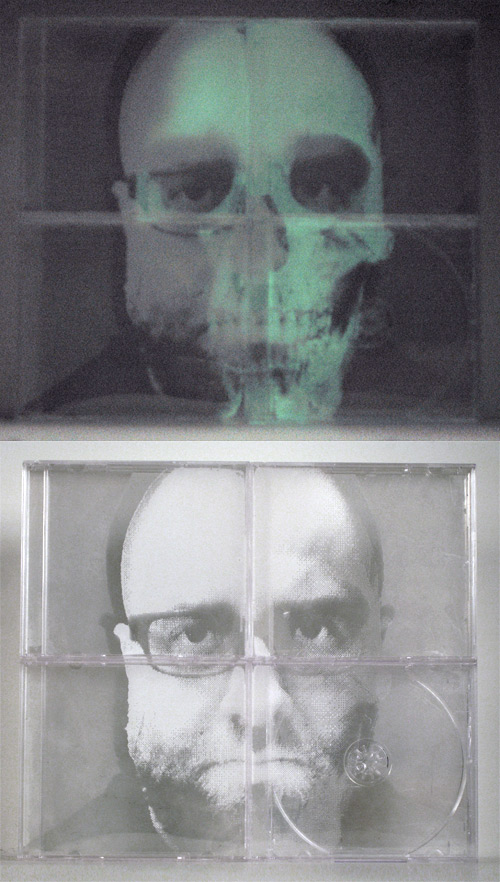
Thse are two states of the same image. It is made up of three layers of screen printing on recycled jewel cases. The first picture was taken in the dark with the phosphorescent layer showing through. The second in the light. I'm not sure why I decided to use the ugliest picture I could find of myself, but there you have it.


Comments
i like the starkness of your image, and how the slight asymmetry of your face is detectable with the grid of the cd cases. i think your nose is cute.
Posted by: Melissa | January 9, 2008 3:37 PM
This stuff is really impressive eric. love the fact that you are using a media (cases) that is going to be obsolete soon. there is something very YOU about that. keep doing what your doing, you have a fan in me. I think your nose is cute too.
Posted by: Mike Gallay | January 10, 2008 3:28 PM
I just watched "The Devil's Backbone" last night. Your image remind me of Santi...'the one who sighs'...superb!
Posted by: Jon Keegan | January 10, 2008 3:40 PM