Posted by: pa (190 posts)
August 13, 2005 4:04 PM

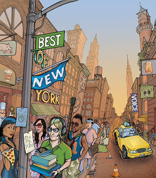
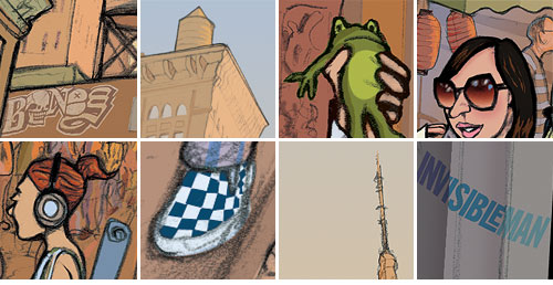
I've justed turned in this illo which will be promoting the Village Voice's 'Best of New York' issue which comes out in October. My main concern at the moment is whether the lower portion of the art is printing too dark - darker and more saturated than on my monitor anyway... I may have to tweak that. The architecture is mostly a blend of Chinatown, Soho, Lower east side, the East and West Village. Here's a few details:


